

Flutter Advanced - Adding Dark Mode | Dynamic Theme using Provider
Let's add multiple themes to our Flutter Application, the easy way using Providers


Until now in the series, we have used providers to accomplish tasks such as managing our app-wide state and our backend data. But we can also use providers to our advantage and accomplish other tasks too. One of them being adding dynamic themes to our Flutter application.
In this article, we will see how we can add multiple themes to our flutter app, i.e, apply the super cool 😎 🌘dark mode using the provider. So without any fuss let's get going!
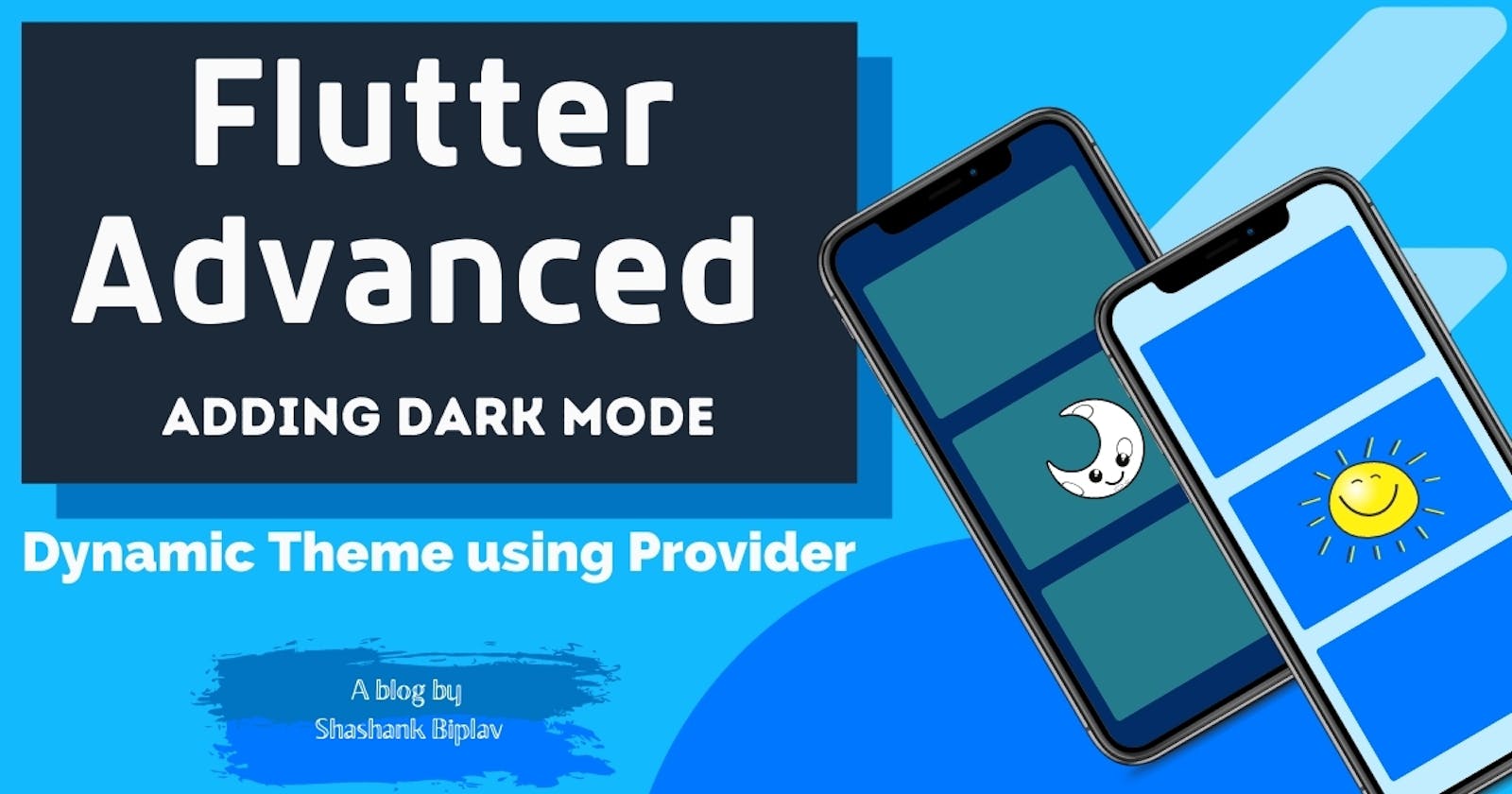
The app we are building
Here is a preview of the app that we are building,
As you can see with the tap of the button the whole theme of the app changes from light to dark and vice versa. This is happening because the app uses a provider behind the scenes to toggle the theme of the app.
As soon as the theme data in the app changes the whole app reacts to the change!
Implementing dynamic themes
- Create a new Flutter project to see dark mode in action or you can continue with your own app.
Installing packages
At the time of writing this blog Flutter 2.0 is out and provider package version ^5.0.0 is out. If you are continuing with a new project I would recommend using the latest versions.
In case you are implementing this in your older projects, I would not recommend upgrading your Flutter SDK and continue with the previous package of provider may be less than version 5.0.0. In specific if you are searching for an older specific version ^4.3.2+3 is stable and will work fine for your older projects.
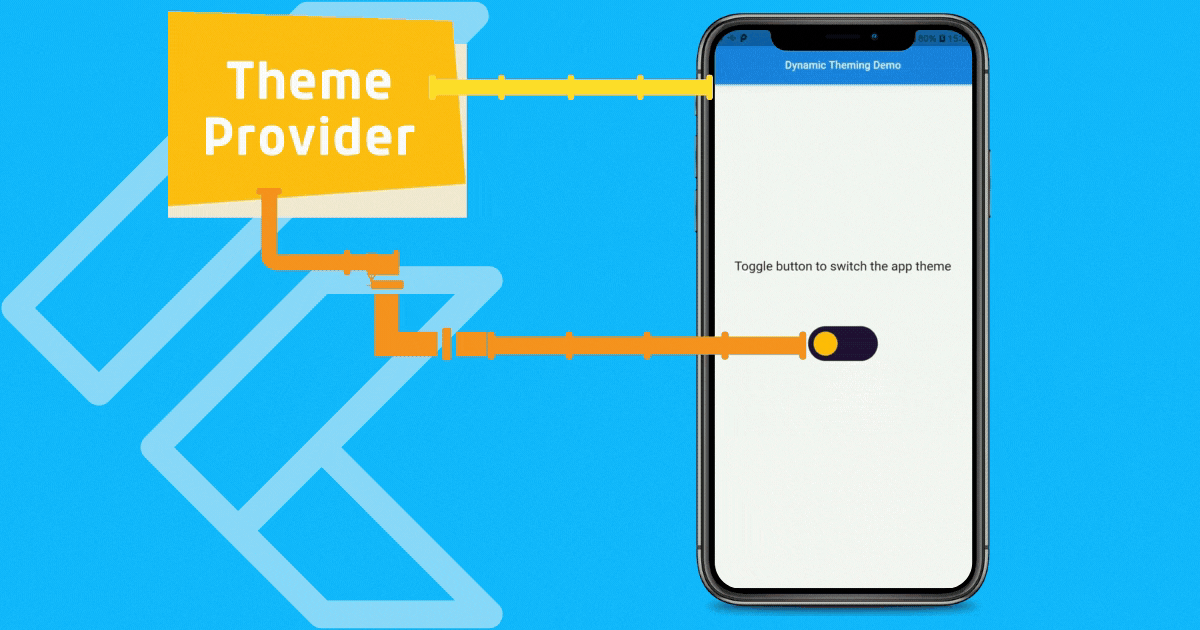
Creating the Theme Provider
Now, in the lib directory create a providers directory if your project doesn't have one. All the providers of your project live here. In the providers directory create a theme_provider.dart file. All the theme-related logic will live here and the file will look like this,
import 'package:flutter/material.dart';

class ThemeProvider with ChangeNotifier {
  ThemeMode _mode;
  ThemeMode get mode => _mode;
  ThemeProvider({
    ThemeMode mode = ThemeMode.light,
  }) : _mode = mode;

  void toggleMode() {
    _mode = _mode == ThemeMode.light ? ThemeMode.dark : ThemeMode.light;
    notifyListeners();
  }
}
In this file, we import the
material.dartpackage as usual to use theChangeNotifiermixin which is provided to us my this package. If you need an in-depth overview on ChangeNotifier and providers in general refer to my previous post.We need a variable of type
ThemeModewhich is a private variable inside thisThemeProviderclass named_mode. This variable holds our current theme!Also to have this private variable
_modeaccessible outside this class we need a getter so we have the getter in place.Initially, the default theme of our app is Light hence we initialize it with
ThemeMode.lightor else if there is a preexisting value then we assign that to our private variable. More on this later.We have a function
toggleModewhich has the return type ofvoidwhich we can use to change our app theme. This method can be accessed from anywhere in our app as long as that widget is attached to this provider. This is the method that is executed by our toggle button to change themes.
Attaching Theme Provider in main.dart file
It is recommended to attach theme providers at the top of all other providers because this controls the theming state of your entire application. Hence our main.dart file looks like this,
//Packages
import 'package:flutter/material.dart';
import 'package:provider/provider.dart';

//Providers
import './providers/theme_provider.dart';

//Screens
import './home_screen.dart';

void main() {
  runApp(MyApp());
}

class MyApp extends StatelessWidget {
  @override
  Widget build(BuildContext context) {
    return MultiProvider(
      providers: [
        ChangeNotifierProvider(
          create: (ctx) => ThemeProvider(),
        ),
        //Your other providers goes here...
      ],
      child: Consumer<ThemeProvider>(
        builder: (ctx, themeObject, _) => MaterialApp(
          debugShowCheckedModeBanner: false,
          title: 'Dynamic Theme Demo',
          themeMode: themeObject.mode,
          theme: ThemeData(
            primarySwatch: Colors.blue,
            primaryColor: Colors.blue[600],
            accentColor: Colors.amber[700],
            brightness: Brightness.light,
            backgroundColor: Colors.grey[100],
            fontFamily: 'Karla',
            visualDensity: VisualDensity.adaptivePlatformDensity,
          ),
          darkTheme: ThemeData(
            primarySwatch: Colors.blue,
            primaryColor: Colors.blue[300],
            accentColor: Colors.amber,
            brightness: Brightness.dark,
            backgroundColor: Colors.grey[900],
            fontFamily: 'Karla',
            visualDensity: VisualDensity.adaptivePlatformDensity,
          ),
          home: HomeScreen(),
        ),
      ),
    );
  }
}
Importing the packages, providers, and widgets as usual we attach the
ThemeProviderat the top of all other providers in theMultiProvider. We are usingChangeNotifierProviderto attach our theme provider because the provider data is not constant and will change later at some point in time.Next, our
MaterialAppwidget which is at the top of our widget tree is the active consumer of ourThemeProviderhence our whole app will rebuild as soon as the data inside our theme provider changes and this is what we want!In the constructor of our
MaterialAppwidget we have named argumentsthemeanddarkThemewhere we can provide themes with multiple configurations respectively. These accept arguments of typeThemeData.Also we have
themeModenamed argument which accepts the argument of typeThemeMode. Rather than fixing it to a single value, we provide it with the dynamic value from ourthemeObjectwhich is provided to us by thebuildermethod of the Consumer.Using
themeObjectwe can access the getter method of ourThemeProviderand get the value of our private variable_modeusingthemeObject.mode.Finally, we have our
HomeScreenwhere we have the toggle button so now let's see thehome_screen.dartfile.
HomeScreen widget
The home_screen.dart file is simply a Stateless Widget that contains the text widgets and our toggle button. It looks like this,
import 'package:flutter/material.dart';

import './mode_toggle_button.dart';

class HomeScreen extends StatelessWidget {
  @override
  Widget build(BuildContext context) {
    return Scaffold(
      appBar: AppBar(
        centerTitle: true,
        title: Text('Dynamic Theming Demo'),
      ),
      body: Column(
        mainAxisAlignment: MainAxisAlignment.center,
        crossAxisAlignment: CrossAxisAlignment.stretch,
        children: [
          Text('Toggle button to switch the app theme', textAlign: TextAlign.center,style: TextStyle(fontSize: 24),),
          ModeToggleButton(),
        ],
      ),
    );
  }
}
Here, all the widgets are wrapped inside a Column widget. Now you would be wondering that my toggle button looks super cool😎, it turns into Sun and Moon shapes depending on the app theme! How did I build that? Here is all the code and logic that makes the custom toggle button.
A gift from me🎁 ➨ A cool custom button
Well, its time I gave you fellas a gift🎁 and what would be more cool than some Flutter Code😅😍🤣! Here is what mode_toggle_button.dart file looks like,
import 'package:flutter/material.dart';
import 'package:flutter/services.dart';
import 'package:provider/provider.dart';

import './providers/theme_provider.dart';

class ModeToggleButton extends StatefulWidget {
  @override
  _ModeToggleButtonState createState() => _ModeToggleButtonState();
}

class _ModeToggleButtonState extends State<ModeToggleButton> {
  Size get s => MediaQuery.of(context).size;
  int isOn = 0;

  @override
  Widget build(BuildContext context) {
    bool _darkModeEnabled =
        Theme.of(context).brightness == Brightness.dark;
        _darkModeEnabled ?isOn=1 : isOn =0;
    return AnimatedContainer(
      duration: Duration(milliseconds: 360),
      width: s.width / 2,
      height: s.height / 4,
      color: Colors.transparent,
      child: Center(
        child: GestureDetector(
          onTap: () {
            HapticFeedback.mediumImpact();
            Provider.of<ThemeProvider>(context,listen:false).toggleMode();
            setState(() {
              isOn == 0 ? isOn = 1 : isOn = 0;
            });
          },
          child: Container(
            width: s.width / 4,
            height: s.width * 0.125,
            decoration: BoxDecoration(
              color: Color(0xff27173A),
              borderRadius: BorderRadius.circular(60),
            ),
            child: Stack(
              children: <Widget>[
                AnimatedPositioned(
                  duration: Duration(milliseconds: 360),
                  top: 0,
                  left: 0 + (s.width * 0.125) * isOn,
                  child: Padding(
                    padding: const EdgeInsets.all(8.0),
                    child: Container(
                      width: s.width * 0.125 - 16,
                      height: s.width * 0.125 - 16,
                      decoration: BoxDecoration(
                        color: Color(0xffFFC209),
                        shape: BoxShape.circle,
                      ),
                    ),
                  ),
                ),
                AnimatedPositioned(
                  duration: Duration(milliseconds: 360),
                  top: isOn == 0 ? (s.width * 0.125 - 8) / 2 : 8,
                  left: 0 + (s.width * 0.125 - 8) * isOn,
                  child: AnimatedContainer(
                    duration: Duration(milliseconds: 360),
                    width: 8 + (s.width * 0.125 - 24) * isOn,
                    height: 8 + (s.width * 0.125 - 24) * isOn,
                    decoration: BoxDecoration(
                      color: Color(0xff27173A),
                      shape: BoxShape.circle,
                    ),
                  ),
                ),
              ],
            ),
          ),
        ),
      ),
    );
  }
}
This is a StatefulWidget and is also attached to the provider. It needs the internal state to hold the current position of our toggle button and the variable holding the state is of type int named isOn.
The value that is assigned to the boolean variable
_darkModeEnabledby the current theme brightness property. If the brightness is dark, i.e,Theme.of(context).brightness == Brightness.darkthen the value ofisOnis1else it is0.When the switch is off, i.e,
isOn = 0then the current theme of the app isLightand vice versa.On clicking the button the method
toggleMode()in theThemeProvideris executed thus changing the theme from Light to Dark and changing the position of the toggle button.
All the animations in the button that you see are due to the use of the
AnimatedContainerwidget and the transition from a full circle SUN to a crescent moon effect is because of a smaller circle overlapping on top of the larger circle.
Conclusion
That was all for this article. A future modification that you can do is save your current theme locally so that the desired theme of the user is saved and they won't have to start initially from the Light theme. Use the shared_prefrences package to save data locally onto the device.
If your app also has some kind of website which also supports Dark Mode then saving it to your backend database is what I would recommend, which in turn will give your users a more unified experience.
I hope you liked this article and also my gift and if you did go ahead and bash some emojis on it! Till then adios and Happy Coding🙌👨🏽💻👩💻!